Long time, no posts.
I’ve been thinking a lot about 180 Days of UI – a challenge that I’d planned to do every day for the full span of 180 days. I got off to a great start and I found myself thinking bigger and better and that’s where I got myself into trouble and stopped. The ideas were really flowing and they were beginning to get complicated.
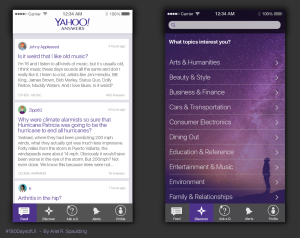
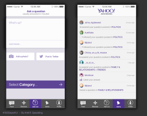
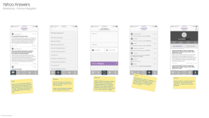
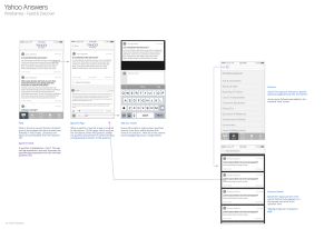
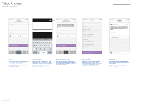
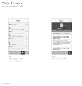
I’ve decided to kick back into gear with a piece that I put together for a fantastic education product group about two weeks ago. In a few days, I had put together wireframes and designs as a rethinking of a website that I once visited on a daily basis.
When I started working on this, it was a little sad.
I felt like I was returning home to find that everything had changed and not for the better. I kept wanting to ask, “Yahoo answers team! What happened here?! The core draw that once kept me returning seems to have been stripped away! Now, your placement for how to ask a question looks like an advertisement. The essence of the humans who ask those questions and spend so much time answering questions, sometimes with very personal experiences – their essence has been stripped almost entirely away. You seem so… inhuman now! Why?”
Objectives:
In this work, I came up with a handful of objectives that I wanted to include as part of my end-product, so even though this wasn’t a business objective set out by a team for a project that I am on, I treated it as though I was under the same project time and budget constraints that a relaunching / MVP might be under.
- I determined that I wanted to bring an element of humanity back to the core of the Yahoo Answers product.
- The new layout and experience should be familiar for mobile users.
- The new experience should have the potential to grow its audience with a younger generation
- The new experience should retain strong familiarity for long-time users
- Categories need to feel more like topic-categories and not like navigation
- MVP release on iOS mobile platform
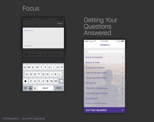
- Asking questions should be simple/easy and readily accessible
- Answering questions should also be incredibly simple and highly accessible
Below are my results:

