It’s been an extended weekend which has involved staying in a Tipi, spending 2.5 hours being scared half out of my whits as my fiance and I go from perch to perch on a 3-4 story high high-wire jungle gym, followed by wine tasting and more fun after that. So after this fun adventurous weekend, I’m ready to return to my UI design challenge!
I had the pleasure of visiting an ATM last week and while I absolutely love my bank (not many could say the same), their ATMs tend to be… very screen-heavy. Simple transactions can often take up to 8 screens at a minimum and some can be even more.
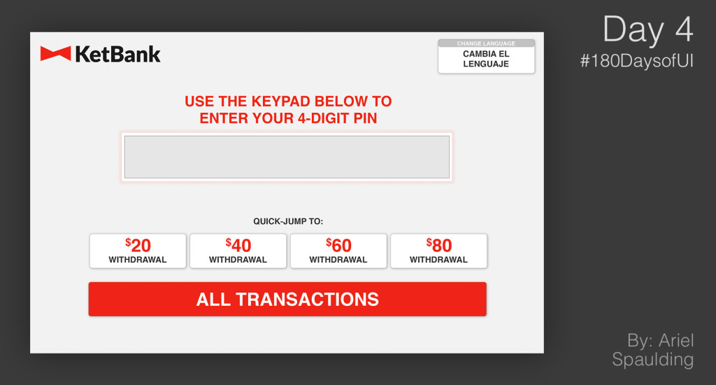
In this UI, I’ve decided to imagine the most likely / frequent ATM usages. I’ve then taken these and populated them directly on the PIN entry screen. The idea is that people like me, who are looking to pull $40 for a craigslist item, can arrive, enter in a PIN and touch the quick-jump option to pull $40, eliminating the 4-5 screens which come after the PIN entry screen, just to complete this money withdrawal process.
Please note: While I creating this, I am replacing the bank’s name and branding icon. However, I am attempting to stay very close to their current branding standards. I’ll keep the real name of the bank to myself. For all of you smart folk who can guess at which bank this is: Good on you. Now- keep it to yourself!!
If you’d like to: Follow this challenge on Instagram and BeHance and let me know what you think!
