I have a fun story to tell.
It was a very hot summer day and we had just pulled into the parking lot of a local store to purchase school supplies for my younger siblings. The heat was greater than usual in the area – in the high 90s, nearing 100°F. The store had recently been remodeled and we were appreciating the new look on the outside and were excited to see the inside. As we were walking up to enter the store, there were 3 ladies heading towards the glass doors to exit, two in bikini tops holding and eating an icecream cone with a huge scoop of icecream on top. The lady who was closest to the door used the arm holding her icecream cone to push on the door for it to open, but because of the recent remodel, the door’s direction of swing had been changed. Rather than pushing and walking out the door, her and the lady closely behind her ended up wearing their icecream cones as they collided with the door.
What happened there?
Before the store remodel, this store’s doors swung out. After the remodel, the doors swung inward. They replaced the signs on the doors, but the handles were nearly identical to the old ones. The individuals who had been to the store in the past didn’t expect the need to read the signs. They expected the same experience they had already established when previously visiting the store, and in turn ended up with a chest full of icecream.
Though this is a real life experience, it illustrates something very important when designing websites and applications for people to use. People have expectations. It becomes more and more important to look around at other applications and websites both within the same industry as well as outside of the industry – to discover the patterns which people are comfortable with using on a daily basis and to maintain those patterns so individuals can find what they are looking for.
In a previous UX focused blog, I mention creating navigation to fit the needs of the different types of people who will visit a website. Specifically for the cherry picking groups, it is important to maintain expectations.
Let me give a few examples. For any company to exist, there are people who work there. Right? Well how do they get those people? Aside from going through placement agencies and posting to various job seeking sites like Monster or even Linkedin, a company typically has something – some place on their website which is dedicated to careers. This is the perfect example too, because job seekers are seriously used to having to LOOK for their content.
Examples
When looking at these examples, think about how long it takes to find the careers section.
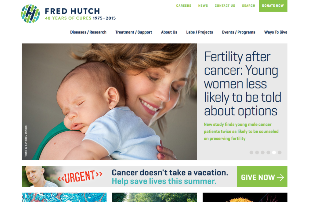
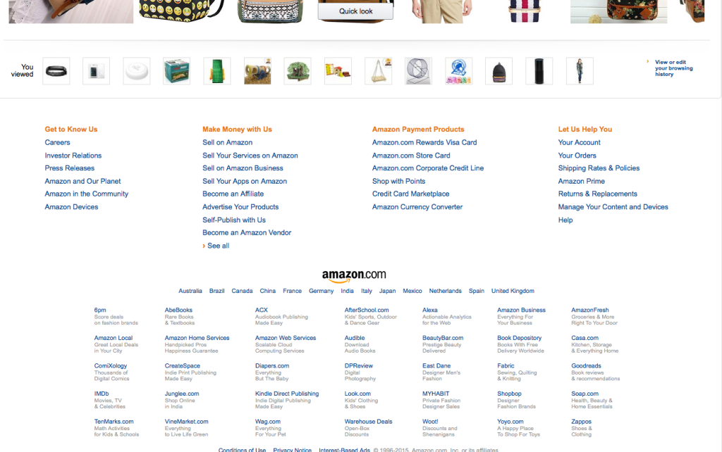
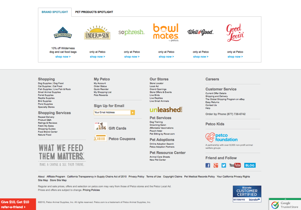
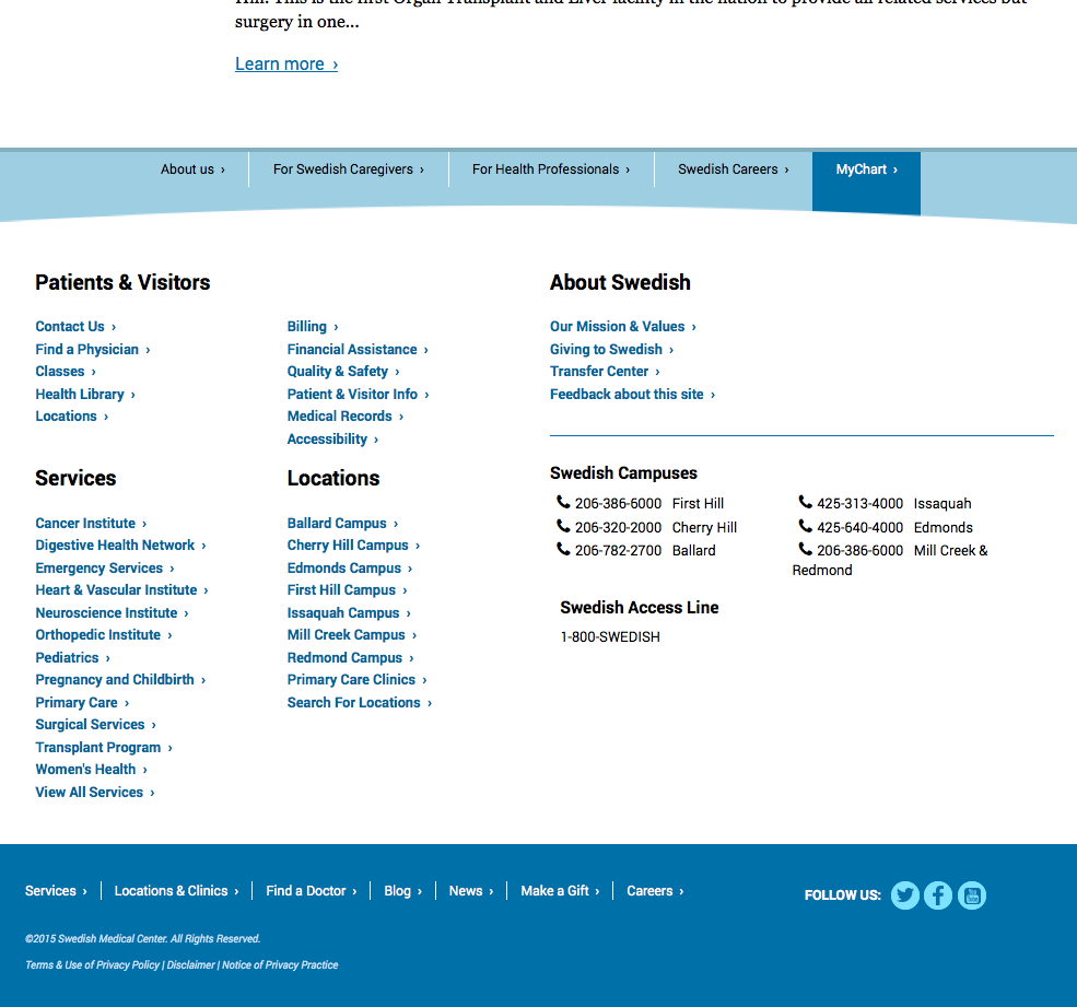
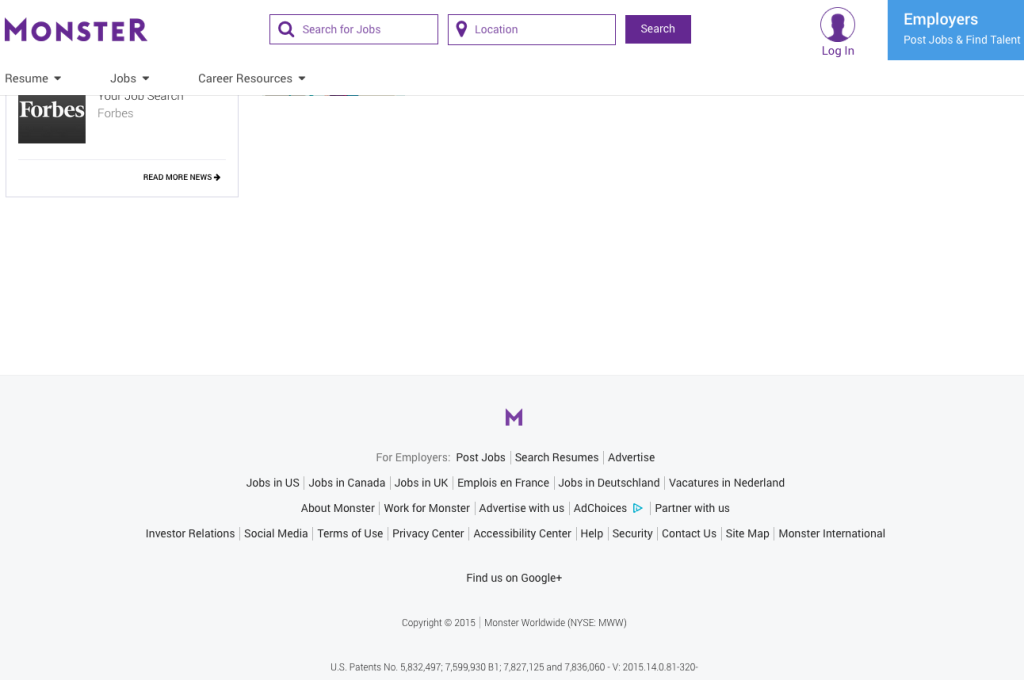
So many types of industries, all follow established expectations
Following the lead of multiple industries isn’t always the best route – but in other cases, it is absolutely necessary to establish a connection with your target audience. By maintaining expected locations, not only can job seekers find the information they are looking for quickly, but they get a sense of fulfillment which builds a positive connection between them and the company’s website they are browsing. When they get frustrated and cannot find what they are looking for – the inverse happens.
What about the inverse?
When careers is placed in an unexpected location, it is overlooked. The job seeker who is visiting the website will immediately discount the primary target navigation (or a tier 1 nav) and will immediately look for a 2nd tier and for the footer. When that doesn’t work, they tend to look in the company’s “About us” section. If they still cannot find it, they either abandon the site or maybe notice that the careers section is in the primary navigation which then results in them feeling… like they overlooked it. This is a negative response. It’s like walking around your house for 20 minutes trying to find your keys – when you realize they’ve been IN YOUR HAND the entire time. Feel pretty dumb, right?
Next time you’re in the hot seat to make the decision about the placement, try to understand the expectations of your target audience. By doing so, you might be able to prevent abandonment rates, or in the case of the remodeled store, angry sticky customers in bikinis.
[…] read the rest at: https://facingblend.com/blog/ux-blog-expected-objective-fulfillment/ […]